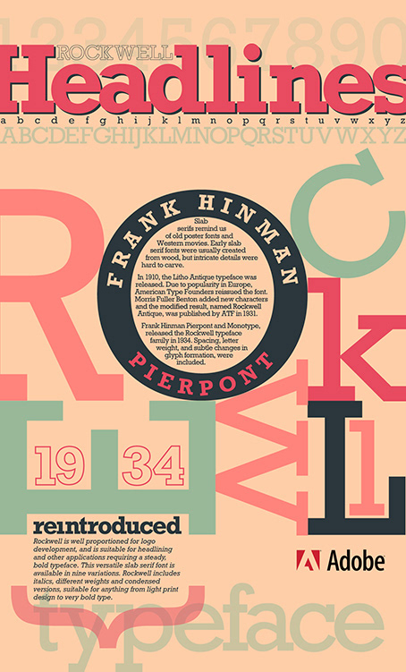
The Rockwell Typeface has been around for years, so I found it necessary to reintroduce it. The "O" is filled with the following text. "The slab serifs remind us of old poster fonts and timeless Western movies. Early slab serif fonts were usually created from wood, but intricate details were difficult to carve.
In 1910, the Litho Antique typeface was released. Due to popularity in Europe, American Type Founders reissued the font. Morris Fuller Benton added new characters and the modified result, named Rockwell Antique, was published by ATF in 1931.
Frank Hinman Pierpont and Monotype, released the Rockwell typeface family in 1934. Spacing, letter weight, and subtle changes in glyph formation, were included."
I love this headline typeface. It is strong and bold. I had some fun with the letters by interchanging the "E" and "W", and warm vintage colors were used to capture eras gone by.